Valentine's Day
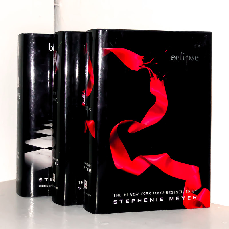
I like this image, because I love to read. I thought this photo was good for Valentine's Day because the books are part of the series, Twilight. Twilight books are in the romantic genre, which I thought was very suiting for Valentine's Day. I also liked how there was red on the book cover. For editing, I first adjusted the crop and then adjusted the white balance. This made the background very white. Then I increased the highlights, so that the glare on the books was brighter.
|

|
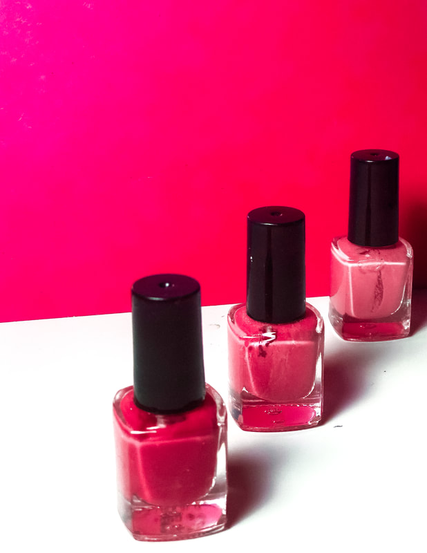
For this photo, I added a pink background (which was a notebook I had), then I placed by nail polish from darkest shade to lightest shade of pink. I like how this photo has almost a shallow depth of field affect, and how you can see the shadows because of the lighting. For this photo I first cropped it and then I tinted the photo red. I then increased the highlights,. so that the bottle was more shiny. I also like how the light was placed in the top left corner, so that the wall had a sort of ombre effect. Lastly, I increased the clarity.
Patterns
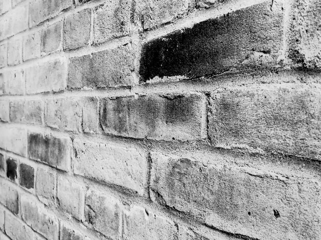
For this photo, I took it at Home Depot. I wanted to get a cool perspective, so I took the photo on thye side of the wall, so it was sort of like a shallow depth of field photo. I adjusted the white balance, so it was brighter, and then the changed the exposure so the photo was a bit darker. I also increased the clarity and sharpness, so the texture of the bricks was more prominent.
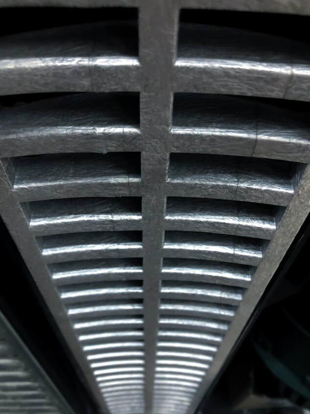
I also took this photo at home depot. I wanted this photo to have a different perspective, so I took the photo by pointing my camera towards the ground, so it was like I was looking down. For editing, I didn't have to crop it. I darkened the shadowns, and increased the highlights. I also made the clairty higher. Lastly, using the feather tool I darkened the outside of the image so it was black.
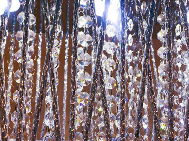
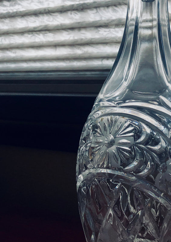
For this photo, I put my phone inside the light in my room. For editing, I first cropped the photo, and then I changed the white balance, so the light was brighter. Then I increased the exposure, and saturation, so the colour was more intense. I also increased the clarity, so the detail on the crystals, and poles, were better. Lastly, I darkened the shadows, and added a very slight tint of blue. I like this photo because of how sparkly it is.
Winter Wonderland
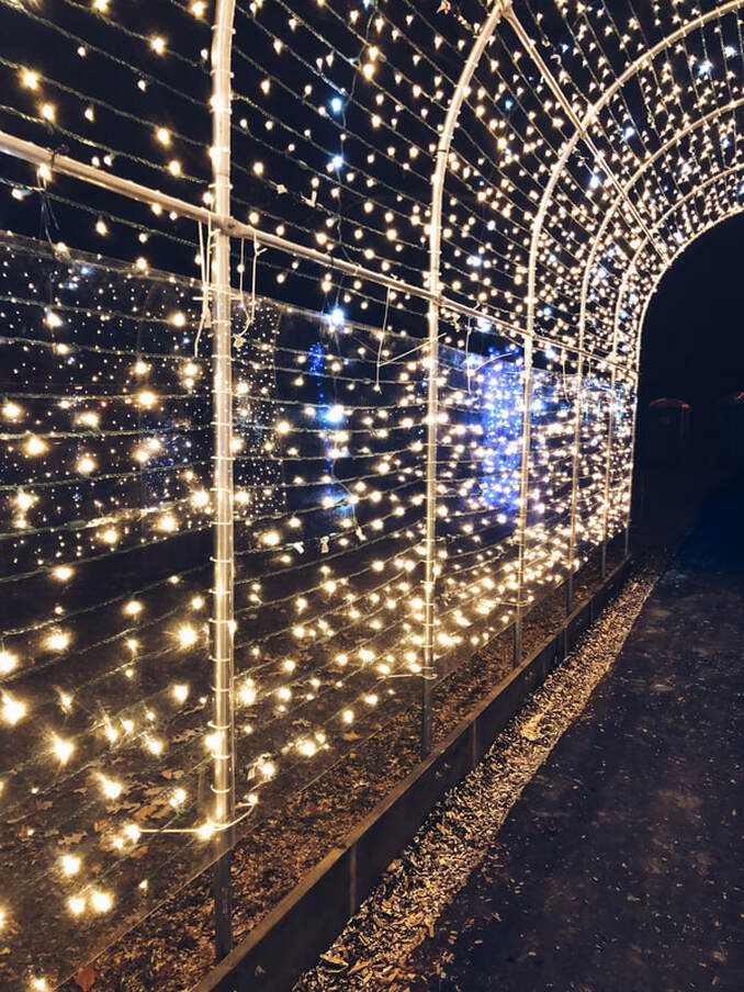
I took this photo in Jackson Park, when the light show was going on. I like the contrast between the dark ground, and the bright lights. For editing I cropped the photo. Then I found the medium grey, so the white balance was good. Then, I used the shadow and increased it. I also used the feathering tool, and used it on some of the bigger lights, so they become more white, and sparkly. I also changed the tint of the image to be more blue/purple. Looking at this photo, just takes me back to Christmas time!
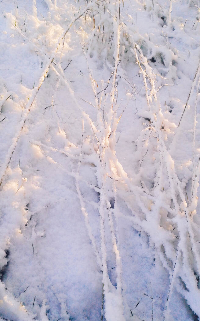
I took this photo in a forest. I liked how the sun was reflecting off of parts of the snow. To edit it, I cropped the image, and made it longer in length. To edit it, I made sure I found the white balance perfectly, since I wanted the snow to be very white. Then I tinted the photo slightly bluish, just because in my opinion it still looked to yellow. Then I made the clarity higher so that the sticks were more detailed. Overall this picture just screams Winter!
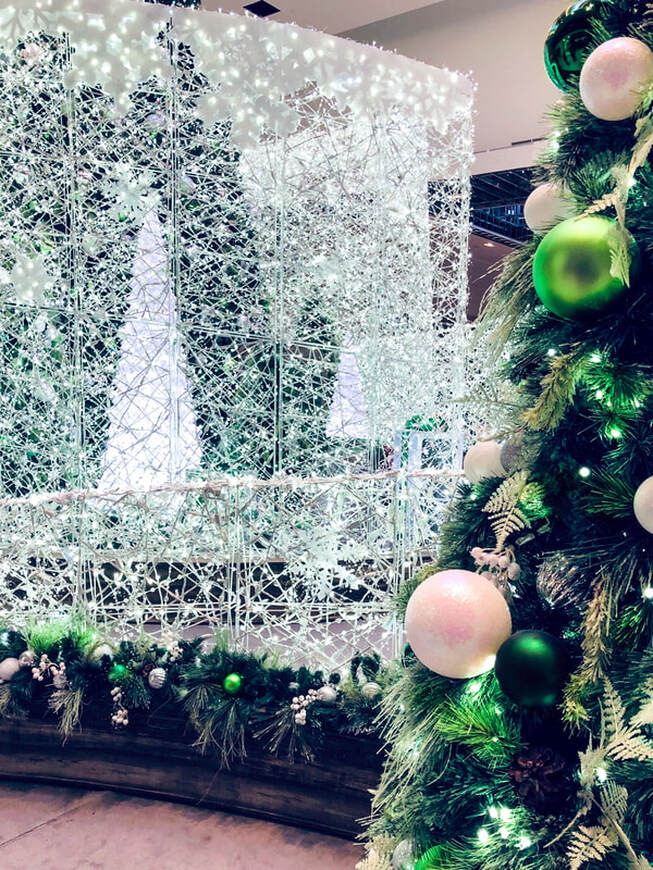
I took this picture at Devonshire Mall, during the Holiday season. I wanted part of the Christmas tree to be in it because of how green it is (it pull out the green from the background). First I cropped the photo so that not too much of the tree was in it. The I found the white balance. Then i turned up the saturation and vibrancy so that the green on the trees was brighter, and more intense. I also turned up the clarity anf sharpness, so taht the white in the background could stand out and be more detailed. I then used the feather tool, and turned the brush green, and painted some of the ornaments so they could stand out more. Lastly, I turned the highlights on higher. Overall, I love the green in this picture. I think it balances well with the white.
Bottles and Glasses
|
I think this glass is very beautful. The detail is what catches my eye, so of course that is what I wanted the focus to be of the picture. I first cropped the image by zooming in, and then I straightened it out so that the lines in the window appear straight. For editng I added a blue tint after finding the white balance because I liked how that looked best. I then added more highlights to make the glass appear more glossy, and make the background lighter. Then I added sharpness and more detail so that the whole photograph appeared more crisp. I like the contrast f the glass with the dark backrgound. I think it really makes the whites in this photo stand out.
|
|
|
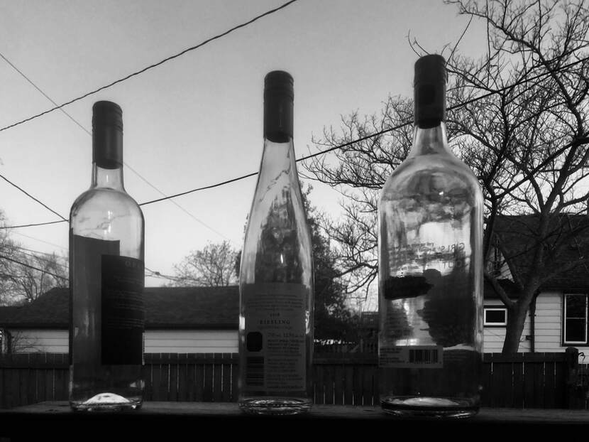
This photo was taken of empty bottles. I decided to take this photo outside because the lighting was much better then inside my house. When editing, I realised that there was not much colour in the photo to start with. I know that I could add more saturation to increase the colour, but I still didn't think that was going to be enough. So i changed the photo to black and white. I thnen cropped the phto to how I liked it. I added more shadows, I took away some highlights. I also darkened the black.
|
|
|
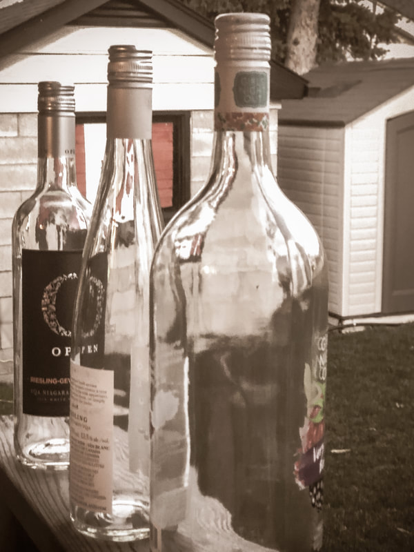
Okay, so I decided to use the same bottles as above, but take a picture from a different angle. This showed a whole different part of my backyard, making the background different from above. I like this photograph much more. I like it better because of the editing I did to it, and the vintage feel I think it gives off. I first used a preset on lightroom called, old age photo, and went on from there. On my iphone, I wanted to crop this image and it automatically made everything straight for me. For editing, I wanted to keep with the vintage feel so I didn't want any saturated, bright colours. I lowered the exposure, and saturation. I also lowered the highlights because I thought the glass on the bottles looked better like that. Then I added clarity so that the details in the picture really popped. Lastly I added a vignette, but made it so that the outside corners were brighter. I used the feathering tool to make sure that there were no harsh lines from the vignette.
|
|
Hands
|
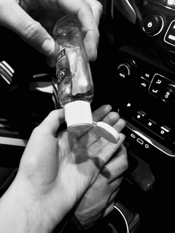
Since hand sanitizer is very popular because of covid-19, I thought that a picture with it would be very appropiate. I took this picture of my hand and my mom's hand putting hand sanitizer on. While editing, First, I cropped the image to how I liked it. Then I used the preset on lightroom, black and white. I thought that this added a more dramatic look on the photo. Then I found the medium grey, to make the whites brighter and the blacks darker. Then I added more shadows, highlights, and definiton. I also liked how dark the background was, so I added more of a vignette.
|
|
|
This is a picture of my mom reading. Reading is one of her favourite past times. For editing this photo, I didn't have to crop the image, beacsue I already liked how it looked without it. Then I changed the photo to black and white, but changed some of the intensities of the colours to make the image more sepia. I sharpened the image to make the details on the hands pop. I also added more highlights, to increase the highlights on the hand, and I added more shadows.
|
|
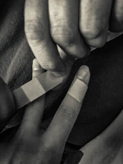
This picture of "helping hands" was actually taken because I cut my finger. My mom was putting a bandaid on my finger and I thought it was the perfect opportunity for a photo. I first cropped the image to my liking, and made it so a viewers eyes would be focused more on the center. I also made this picture black and white and added more sharpening to the hands, so you could see the lines and wrinkles. I made the whites brighter, and added more highlights and shadows.
Forced Perspective
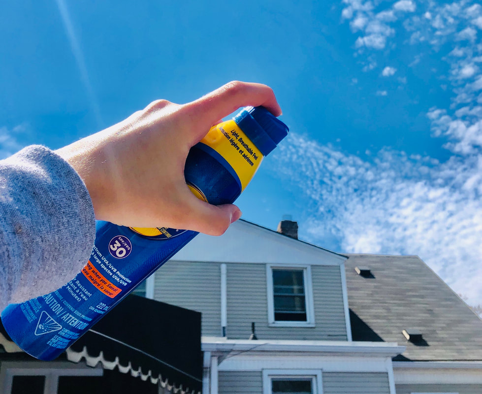
For the inspiration for this photo I looked on google images. I saw many photographs that used a teapot and pretended they were pouring out the clouds. I thought that a good idea would be to pretend to spray the clouds out from abottle. Since it was a beautiful, sunny day, suncreen was the perfect option. For editing, I first cropped the image to my liking. I then increased the saturation, and hye of blue to make the sky and sunscreen bottle stand out. Overall I think I did a good job on this photo.
Spring
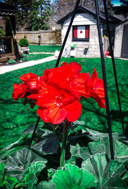
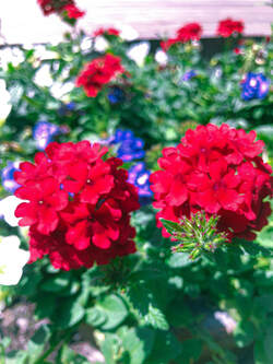
First looking at this photo, I like how the red from the flowers balances with the canadian sign in the background. I also like the shallow depth of field affect this photo has. I increased the saturation so that the flowere and grass were very vibrant. I added a bit more clarity, and sharpness. Lastly I added a very small amount of vignette around the edges.
My mom had just bought flowers and I thought this shooting assignment was the perfect time to show them. Contiuing with the flower theme for spring, I decided to capture these two flowers using portrait mode on my phone. This way it made the background blurry, providing a shallow depth of field. For editing I first found the white balance, increased the saturation and brightness. This making the photo more colourful and bright. I cropeed the image so that most of the focus was in the middle, because I thought it looked best. I also added more clarity and texture. I love the overall colour of this image, and the contrast between the green and red.
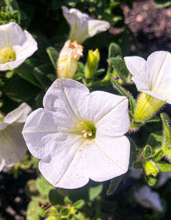
For this photo, I wanted to find a flower that wasn't red like the other ones. I found this pot of flowers and thought it would be cool to really zoom in and see the details up close of the flower. For editing I first cropped the image so that only one photo was mainly the focus. I then increased the whites and the saturation so that the flower was brighter. Then I increased the clarity so that on the stems behind the flower you could see the amazing detail. Out of all the photgraphs I took this day, this one is by far my favourite.
Scavenger Hunt
1. leading lines
3. Leaf
I found a tree with another one in the background. I thought that if I cropped the pictures and really zoomed in on the leaves it would look more interesting. I increased the saturation and vibrance, making the photo appear brighter and overall happier and not as dull. |
2. Forced Perspective
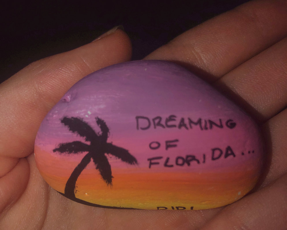
4. Colourful Rock
My friend Sophia painted these rocks for me and my other friend, Sabrina. We were supposed to go to Florida this ummer together, and now we are not sure if it will happen because of Corona. I wanted this photo to have a dark background, so using flash on my phone allowed that to happen. I cropped the image so that it was a tighter crop and the rock was in the center. Then I added more saturation and darkened the shadows. |
|
5. Something Tall
|
6. Something Small
|
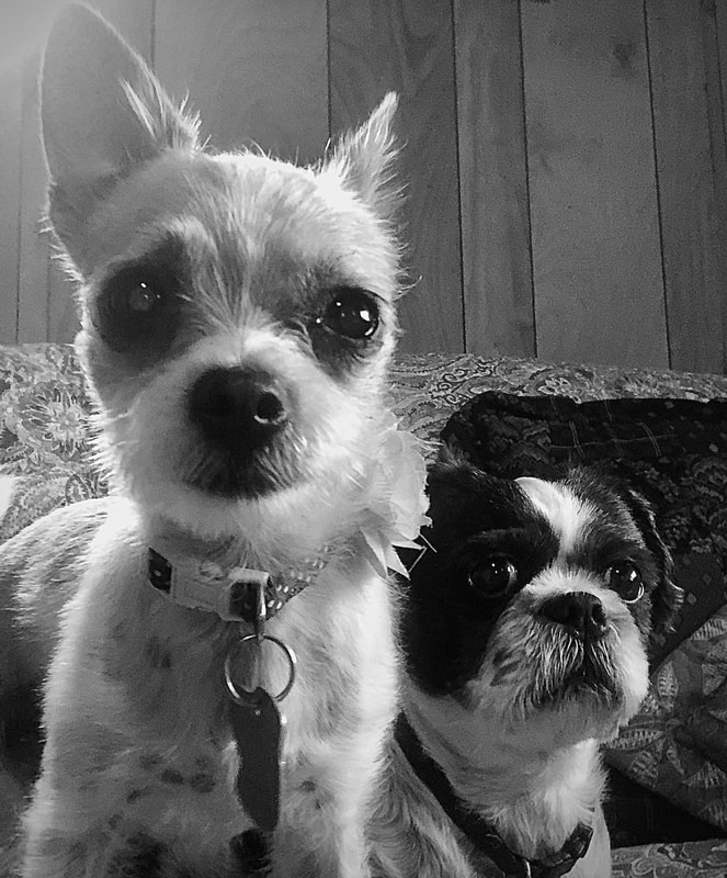
7. An animal
I wanted this picture to be in black and white. So first I cropped the image, and then I made the clarity higher. This way we could see more of the fur on the dogs. I darkened the shadows, and added a slight vignette to add on to the darkish theme. |
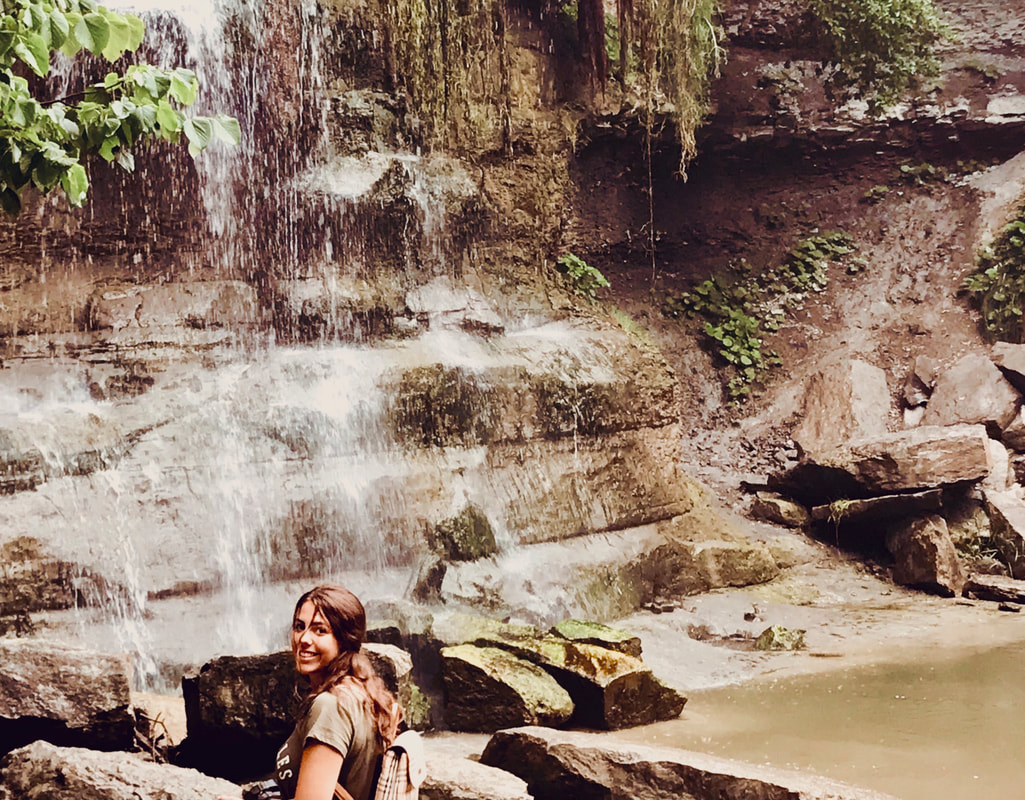
9. Nature Selfie
This photo is of me near grandbend. I cropped the image to my liking. I wanted this photograph to have a warm tint, so I made sure I added a small tint of yellow. I increased the saturation just a bit to make the colours stand out more. Overall, I like this photo because it reminds me of a good time. |
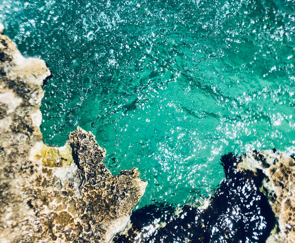
9. Something Rough
When I think of something rough, I automatically tink of rocks. This is a photo I took while on vactaion in Cozumel. I love the colour of the water and how the rock looks here. I cropped the photo to make it smaller. I increased the clarity and texture for the detail of the rock. I also added more saturation so that the water was even a prettier shade of turquoise. |
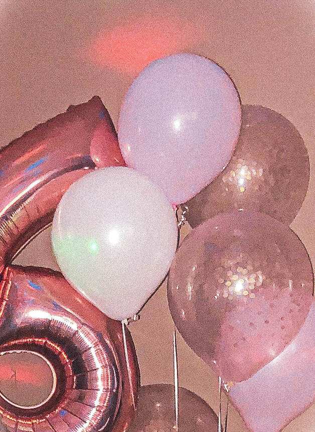
10. Something round
I think that balloons fall under something round. These are from my birthday. I cropped the image so that it appeared the balloons were more zoomed in on. I used a vintage warm preset I found on light room. I added a bit of grain to compliment the vintage filter. Lastly I added saturation and brightened the picture up with more exposure. |
|
12. A Nature Shaped Letter
|
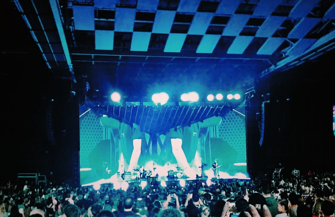
11. Favourite Colour
My favourite colour as you can tell from this picture is blue. I took this photo at a concert I went to. I love the pattern of the ceiling of the outdoor venue. For editing, I cropped the image so that the stage was the main focus. I added more stauration and I darkened the image a bit by lowering the exposure. I did this because I wanted the outsides of the stage to be as dark asa possible, so we could really see the lights in the stage. I also logve how you can see the audience in this photo, I think it looks cool.
My favourite colour as you can tell from this picture is blue. I took this photo at a concert I went to. I love the pattern of the ceiling of the outdoor venue. For editing, I cropped the image so that the stage was the main focus. I added more stauration and I darkened the image a bit by lowering the exposure. I did this because I wanted the outsides of the stage to be as dark asa possible, so we could really see the lights in the stage. I also logve how you can see the audience in this photo, I think it looks cool.
|
13. A Feather
|
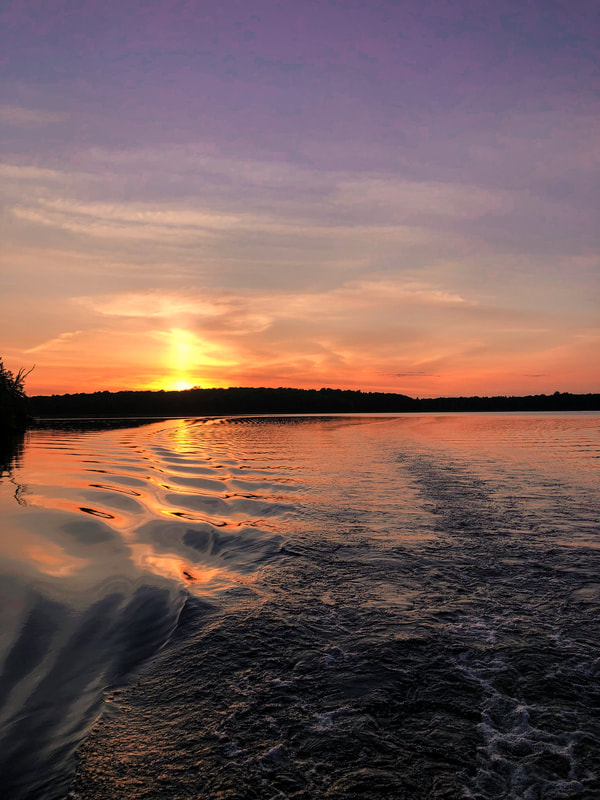
14. Water
This is a sunset a picture I took while on a boat. I love this picture because you can see the ripples in the water because of the photo, and of course because of the sunset setting. I added more saturation to this photo, and added more of a yellow and pink tint. I added more calrity to make the ripples in the water appear even more. |
|
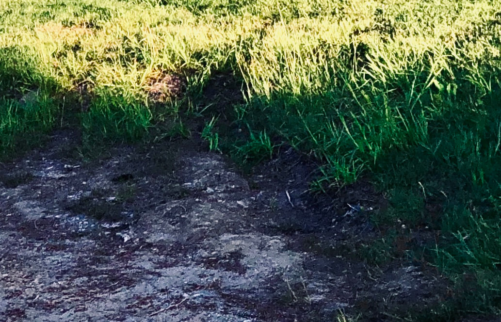
15. A Seed
|
16. Something Noisy
|
17. Beautiful Scenery
|
|
